To colour or not to colour
Should you opt for a single neutral colour throughout your kitchen to create a uniform look or go for splashes of colour that add interest and depth to your design? Here are the pros and cons:
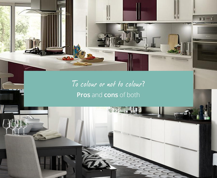
Single colour scheme:
Soft colours make for an effortlessly chic, modern and harmonious kitchen.
Cabinets and walls that are the same hue create a seamless, open space and pale colours, such as white or grey, reflect the light to make the room look expansive.
Muted colours make a space feel peaceful and relaxing.
Neutral colours are like blank canvases; they’re trend-proof. The overall look of the space can easily be adapted with colourful flowers, bowls of fruit, patterned tiles and photos.
However, a room that’s entirely white is trickier to keep clean and can look sterile and bland. Accents, like crockery and countertop appliances, add character – you can get rid of them when you get bored and update the look cheaply.
Splashes of colour:
Colour brings vibrancy, warmth and character to a kitchen.
Splashes of bright colour across key areas, like splashbacks or kitchen islands, attract the eye, add depth and make kitchens look fun!
Colour gives a kitchen an instant facelift while maintaining the traditional character of a classic kitchen.
However, it’s harder to change colourful cabinets and countertops later down the line because you have a fixed colour scheme to work with.
Colourful kitchens can begin to look dated as fashions change.
A two tone kitchen that combines muted colours with brighter elements is a useful way to getting the best of both worlds!
31st Jan 2017